

Green Takes Center Stage in 2013 – Oregon isn’t likely surprised
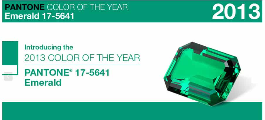
Emerald Green is Pantone’s color of the year for 2013. I love seeing the color celebrated and used so prominently this year in fashion and interior design. I sometimes tell clients that green is like the “y” in the alphabet. Remember the “a-e-i-o-u are vowels, and sometimes y”? Used thoughtfully, green can be substituted as a powerful neutral. This makes sense, because it is the original neutral in nature. When you mind’s eye recalls a beautiful backdrop of wildflowers, a majestic mountain view, green likely had a very important supporting role. The color green is such a hidden gem. This year it takes center stage.
If you are an Oregonian, you probably already have an appreciation for many shades of green. My eyes love the texture and color of the vibrant green moss that grows here in Oregon. I love the true green color of wild ferns, the young tendrils of new growth, and the dark brown green in evergreens. I love green infused with other colors and neutrals. I love grayed green mixed with blue (aqua), vivid green mixed with yellow (lime), green mixed with gray and brown (shark skin), this list goes on and on.
This emerald green door makes a vivid statement in this staircase, backed with supporting cream and grayed neutrals.

Photos via Willard & May’s Front Door Pinterest Board
Some fun facts about the color green:
All colors affect our disposition and mood. Green soothes, it relaxes us mentally and physically. It offers a sense of renewal, self-control and harmony.
- Green is the color of the heart chakra. Opening the heart chakra allows a person to love more, empathize and feel more compassion. Couldn’t we all use a little more of that?
- The human eye is able to discern more shades of green than any other color, because it occupies more space in the spectrum visible to the human eye. It is no wonder there are more green shades of paint color that any other color.
- Green is second only to the color blue as the most popular favorite color.
- Green is so widely used in the natural world, that is an ideal backdrop in interior design. We are so used to seeing it everywhere.
- Green is considered the color of peace and tranquility giving interior spaces that feeling when the color is infused in a supporting role.
- In China, jade stones represent virtue and beauty.
- Chartreuse (yellowish green) is the most visible color.
- In some cities, firetrucks have been modified from red to a yellowish green color to make them more visible and obvious to the eye.
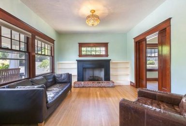
Green can be used in all build and decorating styles including contemporary, lodge, arts and crafts, traditional, transitional, Asian… the list goes on and on. I love the quiet sophistication in this traditional living room is backed in Emerald Green. This is a great example of mixing traditional elements in colors and forms that update a space. There is nothing stuffy about this living space. Once again the neutrals, textures and lines make the color feel sophisticated and classic.

Photo via Willard & May’s Front Door Pinterest Board
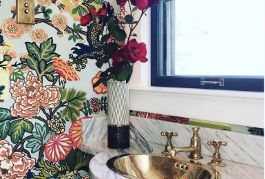
This tile is after my heart. Any takers? Let’s do a bathroom or kitchen backsplash with this beautiful handmade gem!

Custom Emerald Green Tile
For these reasons and many others, green is one of my favorite colors. It is inspiring, renewing, calming, vivid, lively, sophisticated, and most of all universally appealing. It may be one of your favorite colors too, and until now you may have never even noticed.

Angela Todd
Owner & Principal Designer
Angela is the principal designer at her boutique interior design firm in Portland, Oregon. She is known for creating memorable backdrops that tell the story of fascinating and intricate lives.
