Choosing Exceptional Paint Colors

“Oh no! That can’t be the color of the paint chip.” It’s too dark, too intense, too light, and/or generally not the look or feel you envisioned. Perhaps you paint again. What if you select something you don’t like again?
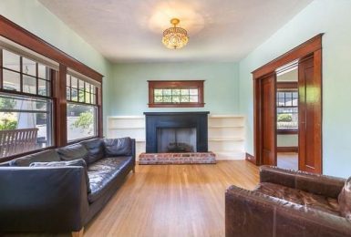
(Above: These dark walls coupled with creamy woodwook and upholstery, create drama in an otherwise traditional room.)
If you have made a mistake now or in the past, don’t beat yourself up. There are literally thousands of colors to choose from. Making exceptional wall color choices takes time, experience, and practice. Below are some recommendations to help you select a show -stopping wall color.
Selecting a Wall Color First Recently, I was at Miller Paint when a retail client asked me if I was a designer. When I told her I was, she casually asked what color she should paint her bedroom. She was looking at Lavender, Green and Yellow swatches. I asked her about her furniture, bedspread, carpet color and room’s style. She looked at me as if to say, “Lady, I just want to know the paint color you recommend. What does that have to do with it?”
Everything. There are literally over a thousand shades of lavender. Are you sure you will find a bedspread, shams and window treatments that coordinate with your lavender wall in a pattern and style you like? It is much harder to build a room around a paint color, rather than selecting a paint color that coordinates with what is already inherent in the room. This point is also true if you have a blank room or are redecorating the entire room. Flooring, carpet, rugs, upholstery and case goods should always be determined before you paint the walls.
Hint: If you are redecorating over time and can’t afford everything you desire at once, still determine your plan. Interior designers can help you put together your plan and stick with a timeline and budget.
The Mood of Your Room You know more about the psychology of color than you realize. Do you want your room relaxing, invigorating, festive, serious, or serene? Once you make your room’s mood choice, remember these descriptive words when choosing colors for the room. To me, warm yellow doesn’t usually go with a serene mood unless it is a very subtle yellow that feels neutral. I also wouldn’t recommend soft blue for festive, high energy mood. Instead I might recommend a punchier, complex, or playful blue.

On the flip side, if you frequently change your wall color in the same room (or have the desire) you may be selecting too much color on the walls. The more intense a wall color, the faster your eyes will grow tired of it. If want a wall color with more staying power, pick your intense color favorite, and move up the color swatch two to three hues lighter.
Insider tip: You can ask for any paint concentration you like: 25%, 50% or even 125% of the color of the swatch. If you are still nervous to make a percentage selection, purchase a primer that is tinted with say 50%, paint the walls and then decide if you want more or less than 50% – or if that color is just right.
Copying a Wall Color Unless you are changing everything in your room, don’t select an exact wall color you love from a magazine, friend’s house or furniture showroom accent wall. Instead, duplicate the general color palette’s idea, understanding that the exact color has to coordinate well with your room’s lighting, architecture, furniture and upholstery. The wall color that matches best in your room may be significantly different than the wall color that inspired you.
Selecting Harmonious Colors If selecting or identifying a color palette for your room scares you, take ideas from your existing fabrics and artwork. Homes tend to flow well when we borrow an element or two from the adjoining rooms. Your wall colors should support one another and not clash. If your room flows to another without a doorway, know that painting with a bold color generally means you need to make another bold color choice in next room.
Just Because They Make the Color on a Swatch, Doesn’t Mean it Should Be a Wall Color Be particularly cautious with yellows and swatches with intense hot or cool color. Your 2”x2” swatch multiplied over 1000 times on your walls is going to be much more intense. Intense colors are best in small quantities. If you like the lime green on the swatch, purchase small accessories for your room that carry that color in the same intensity. For your wall color, consider selecting a pale, subtle shade of your lime green for the walls instead.
Don’t Rush Selecting a Paint Color Making a fast, succinct color decision should only be reserved for those that work in interior color on a regular basis.
Try using an online tool that allows you to upload your own room photographs and then upload a color. Benjamin Moore has a great color tool.
Buy a small quantity of the paint, coat a large poster board with the color and place it on the main wall in your room. Pay attention to the painted sheet at different times during the day. Once you like it on the main wall in all lighting situations, move it to other walls in the room and repeat the process.
Sometimes narrowing down thousands of color choices and second-guessing yourself can be exhausting and time consuming. This is especially true if all you want to do is get the living room/kitchen/guest bedroom painted before (insert special occasion here.) If you want your walls painted quickly, call a design professional that has the experience and color confidence to help you narrow down your options to one perfect color. Color consultations with an interior designer in Portland is a great investment. Angela Todd Designs offers color consultations starting at $225.
Resources of local companies that sell small samples of their paint. Several have low VOC paints are a better for your family and the environment:
Benjamin Moore Paint the number one choice of designers
Devine Paint – available at Miller Paint
Yoho Paint – available at SE Showroom and through designers
Selecting a complementary wall color that compliments the look and mood that you desire is possible with the right tools and guidelines. It is my hope that you follow my suggested color selection guidelines and when you step back to view your new wall color you will say, “Oh yes!” rather than, “Oh no!”
Do you have a room that underwent a before and after color transformation? We’d love to feature you in an upcoming article. Please send us before and after photos via email.
We also welcome you to post comments on this blog.

Angela Todd
Owner & Principal Designer
Angela is the principal designer at her boutique interior design firm in Portland, Oregon. She is known for creating memorable backdrops that tell the story of fascinating and intricate lives.