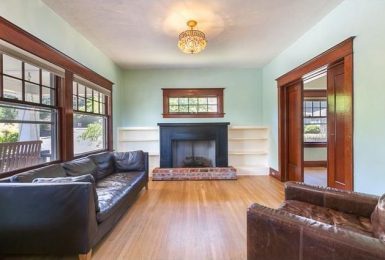
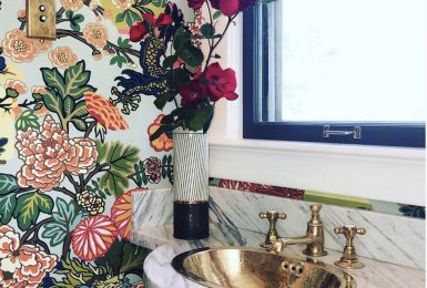
Choosing a paint color? Online isn’t the best way.
I am always slighting troubled when I am contacted by a consumer wanting exact paint colors we used in a project. I generally spend time replying personally educating this client that the photography we shot, coupled with their computer screen reading isn’t a reliable way to select and/or confirm a paint color.
I have found clients make poor paint color choices for three main reasons:
- Clients can’t visually see the multiplied affect of the color on such a large scale (walls). A small swatch will seem fine, but when painted it is too yellow, too blue, too red, etc.
- It is hard for many clients to see the undertones in small color samples. For example, even a neutral has an undertone of green, red, purple and s on. These undertones are a blessing when you know what you want to enhance in the space or what you want to downplay. In my experience, some eyes can’t see these undertones as well.
- Paint colors chosen in fluorescent lights have a totally different mood and feel in natural light and incandescent light.
Today while on Houzz.com, I noted Alan Mascord Design Associates is referring these questions to a brilliantly explained article on their site. Since we share clients a few times a year and know one another, I called this morning and asked if I could also use this post to educate people. So here it is!
When designing the home of your dreams, you want to be absolutely sure that everything you choose and order is the exact color it should be. You spent a lot of time meticulously choosing colors that coordinate perfectly, and you deserve them to be exactly what you expect. Here’s one way to help ensure you’re satisfied with the final results — don’t rely on digital images for your color choices.
Digital Colors: An Overview
Digital photography works by turning colors into numbers. Some cameras use the physics of the light waves surrounding the object to determine these colors, while others rely on the way the eye sees color. In either case, the color the image displays is not always the exact color the item you photographed is in real life. Depending on the lighting in the room, the angle of the photograph, your camera’s preferences, the photographers fixes in a photo editing application and the settings on your monitor, the color you see on the image may be lighter, darker or a different shade completely than the “real” color. This is the same for 3D renderings, only with an added complication – a 3D artist also chooses the color of the sun!
Implications When Choosing Paint and Decor
If you take just the color values from a digital image or the original color name with you to the store, you’re likely to end up with a different color than you intended. This happens a lot, and it leaves a lot of homeowners disappointed. When you get home with your paint or decorative item, it’s not the same color as the picture you were trying to match.
A Better Way to Choose a Paint Color
Instead of relying on digital images to choose colors for your home, use one of these other options:
- Print an image out and bring it with you to the store. After printing, double check that the color on paper is what you want, and then use it to match your paint.
- If your printer is low quality, take your laptop with the image on it. Note that this can be tricky, because of differing light conditions from screen to paper.
- Don’t be afraid to take paint swatches home with you, compare the colors to items you have or colors you see elsewhere, and then return to the store when you have a specific color in mind.
- Hire a professional Interior Designer. Color matching and making your room look great is what they do.
Overall, experience is what it takes to choose great paint colors. Most homeowners can learn what it takes to choose great paint selections. It just takes some trial and error. (Read through the lines: painting swatches on the walls, agonizing, and perhaps painting the room more than once – which may not be how you want to invest your time.) An interior designer isn’t for everyone, but we are quick and masterful at color. We will help you click the easy button!


